Case Study: Keeping core users onboard through a website redesign
This case study begins with the introduction of a very complicated new navigational system and the headaches it caused prior to launching a much needed web application redesign - the first major redesign in over 5 years.
To keep the background information succinct, a 5+ year old web application poised to help Orthopedic surgeons with training and tracking prepared to release it’s first major design update after spending over a year building a mobile application.
The Problem
The mobile application introduced a great way to navigate and track progress — on a mobile device. In the wake of the mobile application’s success, the company decided to utilize the same menu for the web application. And then they integrated the native application’s multi-tiered mobile inspired navigation behind a hamburger menu icon…
To get to a page that used to take two clicks, you now had to find your way through a myriad of menus that looked a little something like this:
The team had major concerns regarding the new site structure and navigational items, and rightfully so. There was talk that the new designs were going to leave the core group of users lost and frustrated. And as friction within the company escalated, the team sought outside help to address the issue. As a result, I was hired on as a consultant to help them identify issues, propose solutions, and rebuild on top of their redesign.
Limitations
This project had a tight timeline, just weeks until planned launch, and it carried its own set of unique challenges. The organization and quality of code was subpar, data models were hard to work with and harder to change, and my team was located in Belarus so our daily scrum meetings woke me each morning one too many winks before sunrise.
And last, but not least, the multi-tiered mega menu was here to stay regardless of the confusion that it caused along side its poor performance implications — so we were going to have to make this work.
Solution
First thing first, we needed to address the concern of whether we were going to be frustrating the product’s core users. So we began by setting up a moderated user test with a group of orthopedic surgeons who were regular users of the product. And we observed. And it was very clear that there were major issues as we watched users become lost and frustrated time and time again.
The three main issues we identified were that:
- Users were frustrated that the horizontal top-level menu was no longer there and they didn’t know where to look for the pages they wanted to navigate to, most opting to use the search bar
- When users uncovered the mega menu, they didn’t want to have to click to get to new submenu levels and didn’t understand which items had submenus
- Users repeatedly triggering the wrong submenus while moving the mouse to a submenu item, and voiced audible frustration
It was clear that we had to go back to the drawing board. It was important for us to revisit the old navigational system to better understand how our users were navigating. We discovered that users liked to go to a topic dashboard in one click from the top navigation, and then navigate from the sidebar on that topic page.
So we reintroduced the top level navigation, but we did it with a new data model that mirrored our new mega menu. It was important for us to introduce only one data structure, even if there were now two different ways to navigate that structure.
And we reformatted and restyled the left navigation on the dashboard pages to match the visual style of the original website and found that this simple stylistic change had a huge impact for the doctors who used the site, because it now felt familiar to them! Our core group of users didn’t care for smaller fonts and new micro-interactions, what they really wanted was consistency.
Users could now navigate to pages that used to take one click, in one click. However, this did not solve any issues with the new mega menu. So we changed the triggers from click actions to hover actions, and we now could get to any page from the mega menu in just one click. Even though overall clicks in the menu would obviously go down, the percentage of users that toggled the menu and clicked through to a page went way up!
In conjunction with our new hover interactions in the mega menu, the aforementioned issue of triggering wrong submenu’s became even more prevalent. So we decided to leverage jQuery-menu-aim to draw a box from selected item to it’s submenu that would deactivate all pointer events until either the bounds are broken or a submenu item is selected. The idea looks a little something like this:
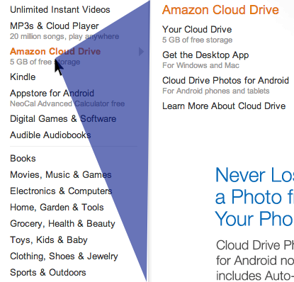
If the cursor moves into the blue triangle the currently displayed submenu will stay open. And if the cursor goes outside of the blue triangle, the submenu switches, giving it a really responsive feel.
Lessons Learned
We learned that a feature, like navigation, that works great on mobile may not be suitable for web for many reasons. Forcing features can have negative implications, frustration being one of them. User’s who know how to get somewhere can quickly get upset if their wayfinding is no longer relevant.
We implemented these relatively simple changes, and found that our core users, as well as new users, were having much greater success getting to the information that they were looking for. The product was still just as complex, but the “navigation frustration” had been alleviated and the team felt confident to launch the redesign, and the new website went live without a hitch.
Last I checked in, monthly sign ups had more than doubled the previous record, mobile app downloads were up over 250% in conjunction with a new homepage feature that we implemented, and feedback from our core group of users was phenomenal — in contrast to the frustration we saw weeks before during user testing.