Case Study: UX audit of sign up and onboarding process
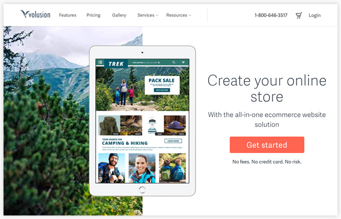
In operation since 1999 and currently powering over 40,000 online shops, Volusion.com is a very successful ecommerce SaaS platform. At first glance, Volusion’s marketing website is slick and shiny, but once you sign up for an account that modern facade is lifted and a product painfully stuck in the past is revealed.
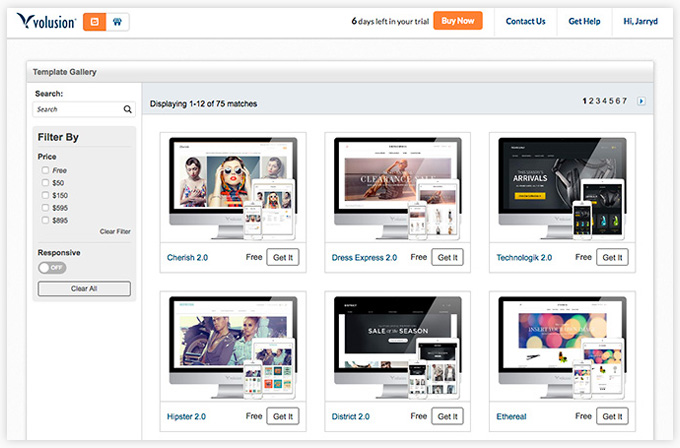
Above is the marketing website, below is the template gallery to view available themes - laid out in a bunch of nested tables.
The Problem
Volusion’s problem was clear as soon as you signed up for a trial. The product felt old and slow and it’s experience couldn’t hold a candle to its future forward competitors like Shopify and Squarespace. As a result, conversion rates were dropping week after week.
We were asked to analyze the competition and re-imagine what we could do between sign up and a user’s initial introduction to the product dashboard to help boost conversions. This project required a detailed understanding of user needs and behaviors, so we started at the beginning with research, as a user looking for a ecommerce platform.
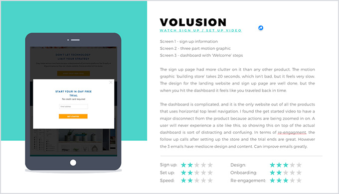
When a new user signs up for a trial account, Volusion creates a store and dumps that user onto a complicated, unintuitive dashboard. Once new users signed up and the dashboard was revealed, only a small percentage of those users would take a single action to start setting up their new store.
It was clear that there were many issues that had to be addressed. If users were unable to get started setting up their store, all hope of converting them into a paying customer were lost. We broke down what other industry leaders were doing to keep trial users moving forward, presented them to the Volusion team and were subsequently asked to introduce onboarding steps and contextual reengagement opportunities.
Limitations
This project had some major limitations in terms of team and technology. I was hired to work directly with the CEO and a ‘growth hacker’, but I was siloed from the in-house design and development teams.
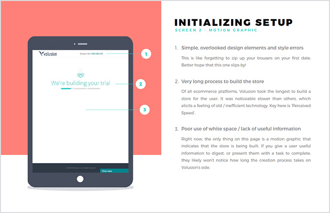
In terms of technology, the store creation process really crawled, and the problematic dashboard was in the middle of a redesign. Both features could use some major considerations, but I was asked to come up with solutions that left these outdated technologies intact.
Solutions
Our goal was to get users from sign up through set up in as few intuitive steps as possible. We really focused on identifying different User Types that would allow us to customize our onboarding and reengagement experiences based on specific user needs.
To address our limitations, I made suggestions to improve the ‘perceived speed’ of store creation by giving users a small task to complete while the store is being configured and introduced steps to pick a theme, set up a logo, and upload a first product / product list so that a User reaches the dashboard with a store that is already visual configured for their brand.
After a handful of deliverables and revisions, I was asked to come out to Volusion’s headquarters in Austin, TX to present to the team leads. Our review consisted of:
- Competitive analysis of big market players: Shopify, Squarespace, Big Commerce, Zoey (by Magento)
- UX audit of sign up
- UX audit of store set up process
- Defining and identifying user types
- Collecting and leveraging user information
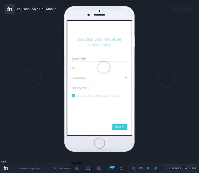
- Prototype sign up flow for desktop and mobile
- Prototype set up flow for desktop and mobile
- Map out reengagement opportunities