Agency Analytics - Email Response
1) How many hours a week are you able to devote to this position?
As many as necessary. I have the bandwidth for a fulltime commitment of 40 - 50 hours a week, no problem. I am also open to contract work.
2) Have you ever worked remotely at a previous position? If so, what methods did you use in order to communicate and go over project specifications?
I have not worked remote in a full time position, but I have worked remote on many contracts with distributed teams across the globe. I recently worked with a team in Belarus in an Agile environment. We had a stand up each morning (early morning on the west coast, evening in Belarus) and communicated throughout the day via Skype. We kept track of our sprints and progress on JIRA. Personally, I prefer Slack and Trello, but all these technologies are accomplishing the same goal - creating clear avenues of communication while keeping teams accountable and on the same page in as efficient of a way as possible.
3) Please describe your developer experience, if any. Specifically, do you have any experience with ReactJS and CSS?
I am familiar with ReactJS projects runnings on a node server, but have not worked with ReactJS extensively. I am comfortable with designing components and OOP. I have worked on a couple applications in EmberJS, which has many similarities. I am confident that I can ramp up my ReactJS knowledge quick, as I am eager to learn.
I consider my CSS experience to be very strong. I am interested and passionate about best practices for performance when writing complex CSS in a large production environment, starting with appropriate, performant selectors. I love designing micro-interactions and animations in CSS that in the past we would use JQuery for. Currently experimenting with building complex illustrations and animations using SVG’s and CSS.
4) Please signup for a trial account at agencyanalytics.com. Analyze the current onboarding screen (verify email, specify name and create campaign). Explain how you would change this area to create a better user experience.
I am going to try and keep this brief and general, because honestly, I don’t feel all that comfortable auditing parts of the website before having a conversation with a human being at Agency Analytics.
That being said, I did a thorough dive into the product and recorded screen cast of the sign up experience on both desktop and mobile.
The sign up form is great. Clean, simple, no distractions. Step 1 to confirm email is easy and appropriate. Step 2 is straightforward as well. Step 3 is where I encountered some friction and I’m sure the biggest drop off is for incomplete registrations.
I encountered multiple bugs in the ‘Create Campaign’ process and wasn’t thrilled that it opened in a modal and tiled additional ‘authorization’ windows on top of that window.
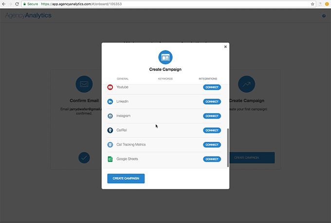
However, my biggest issue as a new user was lack of information to learn more about steps I felt unsure about before listing keywords and giving access to services. Taking these personal actions seems out of context at this stage.
This could be done more effectively within the product when users are setting up a dashboard for the first time. Since the product doesn’t visually start out by leveraging any of the information users provide, it would be more appropriate to integrate these steps throughout the product onboarding.
I wouldn’t suggest making these changes without user testing for positive affirmation and AB testing to leverage user data to make the best data driven decision. There are a lot of small AB test that I think could help polish this experience as well, for instance changing the title from “Create Campaign” to something more inviting (since you are not in the product yet). But my main suggestion would be to integrate the ‘Create Campaign’ steps into the product onboarding. If it is necessary to keep this step before entering the product, I would start by adding more context and testing small changes to help remove user friction.
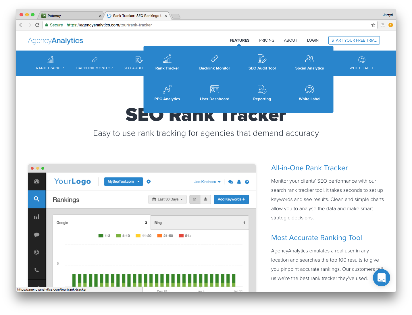
5) Please visit agencyanalytics.com and hover your mouse on the features menu link (you should see a popup with additonal links). Please create a mockup to improve the look of this popup. You may add additional components (ie. description) if you think they are necessary.
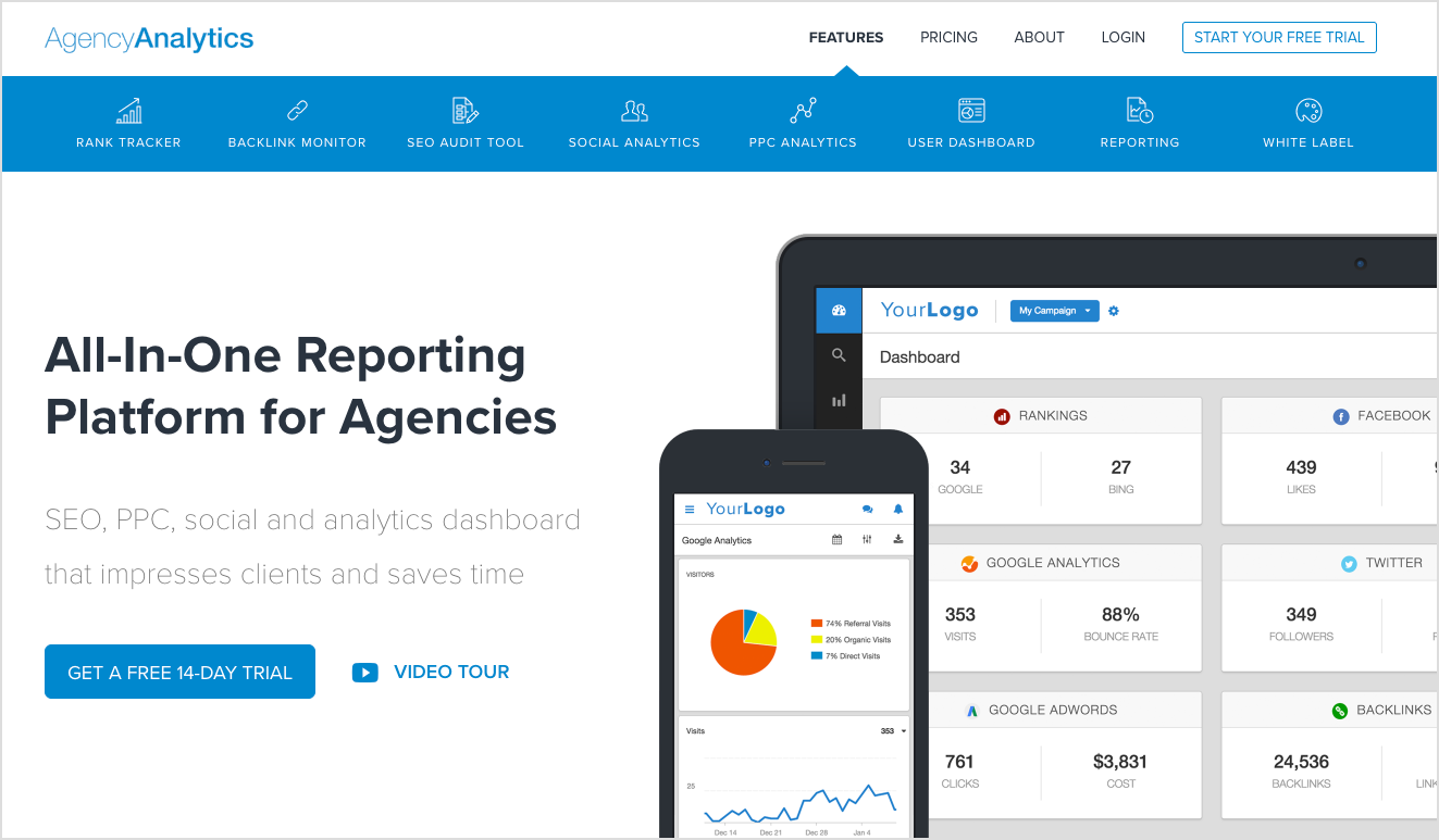
This is an unconventional dropdown from a top nav menu because it is horizontal, tiered, and has icons. I understand keeping design elements from the navigation on the Features pages, but I would suggest moving towards a more conventional navigational pattern and more consistent navigation in general. I would like to see a full horizontal navigation (on desktop) that is the same that you have on the Features pages. A clear example of the inconsistent design not working well:
To affirm what really draws users in best, I would set up a multivariate test with these three states:
- Control
- No dropdown on hover, link straight to feature landing page (or first feature)
- Same feature bar design from feature pages would push content down, as a delightful micro-interaction, to reveal consistent feature nav bar (below)
On that note, thank you for giving me the opportunity to respond to your questions. Would love to talk to someone on the team to learn more about roles and responsibilities. If you have any questions, please feel free to contact me.
In Service ~ Jarryd Wafer