Customer.io UX Design Project
To wrap up this design homework, I planned to pull everything together in a quick post to make it easy for review. So far I have spent about two and a half hours on the challenge and I will spend no more than 30 minutes getting this live - hopefully without too many typos.
To give you a quick breakdown of how I spent my time, I approached the project in this fashion:
- 30 minutes to research, pull assets, plan execution
- 30 minutes writing copy and quickly sketching wireframes
- 45 minutes in sketch building basic components then experimenting with different layouts
- 45 minutes on codepen building out the layout
- 30 minutes writing post and publishing (correction - ended up spending an hour)
Photo of wireframes
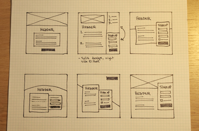
When I began to consider layout, I started with a simple, straightforward design with a call to action that would take you to a form on typeform.com. Even though the layout was simple, going to typeform.com was overkill.
Next I toyed with the idea of a layout split into 3 parts. The left side would have all the content, such as speaker information, and scroll independently. The right side would be a fixed navigation of homeSections and a fixed sign up module. I have seen a couple sites utilize this in really interesting ways, but it is more appropriate for a big project with a lot of content such as a conference website.
To best address the project at hand I decided to simplify ideas to focus on the content. I wanted to make sure that all of the content and sign up information would display on a single web sized screen. I started with another simple layout and then played with some ideas to differentiate the layout by integrating different angles and content shapes and relationships.
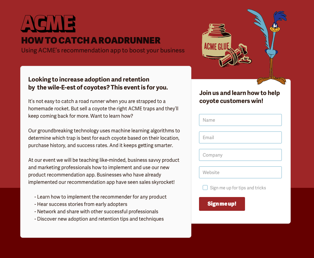
Simple build for web - view full size
Alternative build requiring a bit more time - view full size

Codepen build out
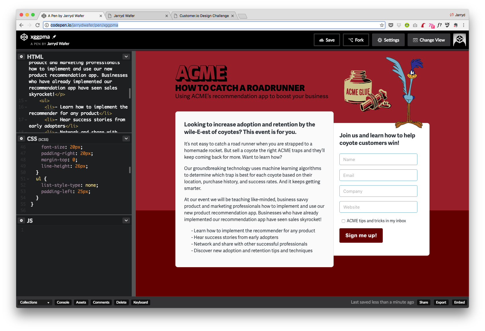
These are two of the layouts that I put together in sketch and decided to move forward with. The sketch design made it very easy for me to quickly build out the first design as a codepen. You can view it here codepen.io/jarrydwafer/pen/xggpma
Followup
To take this one step further I’ll go through what I would do next if I had the budget and time to maximize the impact of this event page. For an event page like this, you can really optimize conversions by optimizing things such as headlines through A/B tests. It is also important to know where users come from, how long they stay on the page, and what percentage of those that click in the form actually complete the form.
Continuing to learn from projects is important so that you can be more effective on the next one. Ideally, there would also be various traffic drivers to the sign up page such as adwords, print ad’s in magazines, email campaigns, sponsorships, etc. For those of you in marketing, you know exactly what I am talking about!
On that note, thank you for giving me the opportunity to present this project to the team. I had a fun time putting this little diddy together. If you have any questions, please feel free to contact me.
Peace out!